


BLK Super Specialty Hospital unveils new logo, offering new healthcare facilities
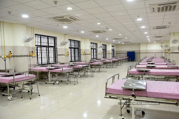
BL Kapur Super Specialty Hospital unveiled a new logo as well as a glimpse of expanded facility hospital. Dr Praneet Kumar, CEO, BLK Hospital who showed off the hospital’s new logo said, the new logo and re-development was followed by an extensive research which aimed at re-positioning the hospital as a super speciality hospital with advanced capabilities in multiple specialties. This manifested itself in change of the logo, change in the 360 degree brand identity and other visual and palpable elements. In Hospital’s new logo, a rich, solid “Burgundy” colour is chosen to represent the gravitas of an institution. The logo includes the “Crest”, which symbolizes the authority and solidity of our institution. Where The Tree of Life in logo represents a symbol of health, Interconnectedness of all beings, the central focus of hospital’s Identity. This tree comes alive from the intersection of crosses, the ancient symbol of life and the two arms forming the trunk of our tree signify care and patient-centricity at a subliminal level. Finally the tree is surrounded by a shield representing protection of people. The new logo also includes a new theme “A passion for healing…….” Dr Praneet Kumar said, “BLK has completely transformed in the last couple of years in terms of infrastructure and the bouquet of services being offered. The hospital possesses tertiary & quarternary care capabilities in almost all specialties. 125 beds dedicated to critical care, 17 modern operation theatres, supported by well equipped laboratories and imaging services, and transfusion services.”

post_id:
uld_count:
Cookie not set
 Like
Like
 Dislike
Value 1: 0
Value 2: 10